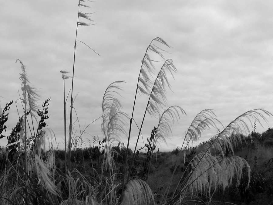
I downloaded the latest version of Photoscape last night and played with some of the new settings. I like that there are now 3 'versions' of monochrome settings but I'm not quite sure if I prefer one over the other.
This is the 'bandicoot' setting. It looks to me like a cross between grayscale and sepia. (Don't ask me about the name--the closest I could find was the color of the bandicoot rat :/ )
This shot was converted to the new 'grayscale' setting--more like what I expect for black and white.
This one is simply 'black and white'. I can see where it would work well on some shots.
Do you have a preference?


12 comments:
Are those toi toi plants or pampas? I love them, they are such an icon in our NZ landscape.
I like all of them, actually. All different; all nice.
Thanks for stopping by my blog. :-)
It's always interesting to find out about new products that are available. I prefer the 'greyscale' for these pics. Black and white is a bit dark but I guess it would work with some pictures. The 1st one is nice - almost an old photo look.
Beautiful post!
The middle one for me. The lower version is too murky for this photo, and detail has been lost. I agree that it would probably work well in other circumstances. It's very interesting to see the different effects.
Prefer the last one as the 'whites' were white rather than grey.
Great shot ... Version 1 is my favorite ... version 3 got too much contrast. It looks nice on the plants, but the lower part of the image is too dark and without details. The effect might look better on a different motive.
My choice... Between 2nd and 3rd...
Tessa~
Wonderful photography in bw of the palm grass! I think I like the last one ~ all are good in their own way ~
artmusedog and carol (A Creative Harbor)
It's a really beautiful photograph, and the first version is my favorite. To me, it shows the widest range of tones, and I like that.
Have a great beginning to your week!
I like the first one best actually, but don't know why really. I think I should find out more about this program (Photoscape)..
In order of my preference:
#2 is my favorite
#1 is next and last
#3 - It looks to washed out.
Post a Comment